March 31, 2011

49) An Ideal Loft

Decoration of Interiors. My client's ideal loft. 2010
Mixed Media.

This project has been my favorite up to now. Each of us had to pick a client, ask them all sorts of questions that would help us understand what their ideal loft would look like, we had to create the floor plan and finally make a 3D model of it.

We were free to create anything we wanted, but with some conditions that we all had to follow: The loft had to have a second story, half of the size of the ground floor from where we could see part of the ground floor and to the outside area, and the opposite wall from the entrance had to be a 6 meter tall piece of glass. The loft was situated on the 5th floor of an 8 story building.

Front view

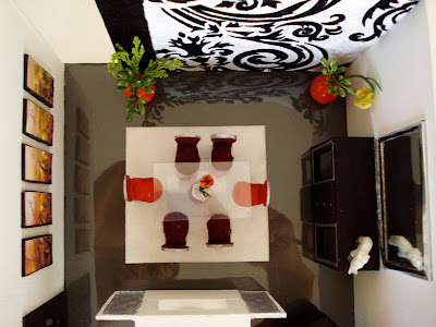
Top view

I picked one of my best friends as my client because i knew she would come up with some crazy ideas for her "ideal" loft and make it more challenging and interesting for me.
She wanted her loft to be very opened and bright, also she wanted the bedroom in the ground floor so that the second floor would only be a huge walking closet, and the best part was that she wanted a jacuzzi in the living room!! Of course she had no problems about privacy so i pretty much had to work with it.

The materials i used were mostly fabric, clay, cardboard, cardboard paper, all other kinds of texturized papers, glue, wire and beads. I went to several fabric stores to get samples of fabric that i loved and used them as carpets and upholstery and created every piece on my own.

I divided the big 6 meter tall piece of glass into 6 different parts with beams and columns for support and for aesthetic reasons. I used opaque glass from the middle to the highest part for privacy issues, and from the middle to the ground i put translucent glass, which was separated in sliding and fixed doors.

East view

The ground floor consisted of an opened kitchen with a bar, a dining and living area, a small bathroom for guests, a bedroom with a small laundry area beneath the stair cases, and a jacuzzi in between the bedroom and the living room. I separated the living area from the bedroom with an organza wall, which provides some privacy but still allows the light to go through (because it is still a little translucent). The flooring was laminated wood for the entire loft, except the bedroom and the first floor which had carpet instead to make it more comfortable. Obviously the jacuzzi is something a little private so i tried to balance privacy with my client's wishes, and finally decided to place it in between the bedroom and living room with entrances from both sides.

Bedroom

Bedroom view from outside

Entrance and dining area

Kitchen, bar and dining area

The first floor consisted of a big bathroom with a big mirror, separated from the walking closet with a glass sliding door, and a small entertainment and massaging area. Its a very opened and bright area due to the several big mirrors and opened space from the main area downstairs.

West view

Walking closet, massaging area and entrance to bathroom

Thank you Vale for your awesome ideas! Te quiero!

48) Ribbon tile, gallery, rustic home

Decoration of Interiors. Other projects. 2010
Mixed Media.

I will show you some other smaller project we made here in Toulouse before our final one:

Ribbon tile
The purpose of this project was to design a ribbon tile for a bathroom or kitchen using any kind of materials. and this is what i came up with.
My grandma and mom have a small jewelry business with african and south american beads, and those beads have been a tremendous help for my models, as you can see in this ribbon tile design.


Gallery:
This was one of our color assignments and we had to play with color combinations, shapes and sizes to design a nice gallery.
I was inspired by a German bank that i saw when i went to Munich to visit. It had two different color lights in the shape of lines that went from the floors to the walls to the ceilings, and i thought it would be so cool for a gallery to interact the art with the viewers.


Rustic Home
I was assigned to create a 2D model of a rustic interior (Living room and entrance). I chose every furniture, every color, every texture and all the lightings in the interior, including as well every piece of ornament. I added small numbers to the plan to link them to the information board underneath.


47) Dividing spaces

Decoration of Interiors. Spaces. 2010
Mixed media.

We were learning about the importance of spatial planning in an interior and for this assignment in particular we had to separate a house into 6 different spaces, (3 closed, one public, one intersection, and an outside area). My closed areas were the two rooms at the back, one bedroom with its private bathroom, and a guest room. My opened area was the living room to the left from the entrance, my intersection area was the halls, joining both the opened and closed spaces, and my outside are was the entrance.
I added a lot of levels to the ground to separate spaces without having to use walls.


Entrance


March 30, 2011

46) A musician's home (From Canada to Peru)

In December 2009, i stopped studying at the University of British Columbia. I took about a year and a half to finally decide what i really wanted to study. I love art so much, but i honestly never saw myself painting and drawing and making art for a living. I wanted something a little different, something that would give me the opportunities to meet more people, to move around more and something that i was really passionate about, so i decided to go for Interior Design.

After having decided what i really wanted to do for the rest of my life, I applied to several school in Canada and Europe. I got accepted in Emily Carr University in Vancouver, but despite of that i decided to come to Marbella, Spain. I had always wanted to live in Europe and i found a design school in Marbella (Marbella Design Academy), and even though i didn't really know what i was getting into at first, i took my chances, and i don't regret my decision at all.
I've met so many great people, i've travelled a lot and i've learnt so much about so many things that it makes me happy so to have come here. I know i closed a good opportunity back in Canada, but i'm more than sure that many other doors are gonna open up for me here.

My classes in Spain were supposed to start in September 2010, so i had 8 months in Peru to do whatever i wanted to do. Obviously i wasn't going to sit at home doing nothing, so I
took a Decoration of Interiors course for a semester in "Toulouse Lautrec Institute".
This was the place where i was really introduced to Interior Design, and i loved it.

Color project. Musician's home. 2010
Mixed Media.

The first thing we did was colors. I already knew so much about colors but every time i go over it, i learn more and more. For this assignment, the teacher told us to find a real client, interview him and make a living room/dining room he/she would love to have.
We wrote down several professions in small pieces of paper, and each of us had to pick one randomly. I got "musician", so i basically had to find a Peruvian musician and interview him.
I chose "Juan Jose Chiquisengo", a very well known peruvian pianist who has had several concerts all around the world, and currently resides in Spain.

After i interviewed him, this was the living room/ dining room i thought he would like:
(I did every single thing on my own, from the walls, to the furniture, to even the smallest details in the piano. It took some time but i loved it.)


Entrance view:


Dining room:


Room divider details + piano:


Living room:


Piano details:


View from inside the dining room:


March 29, 2011

45) Nature Flesh

Painting. Nature Flesh. 2009
Acrylic paint and mediums.

After i was done with "Modernizing Porongo," we had a special guest who was going to teach us all about acrylic paint and mediums, how they work and what we can use them for. I already had a background on acrylic mediums and had already experimented with them the previous year, but i realized that what i knew before was nothing compared to what i was learning at the moment.


Nature Flesh was the successor of Modernizing Porongo, maintaining the same concept but at the same time, integrating what i had learnt.
Nature Flesh is an installation that i created using several separate pieces made of fabric, paint and pouring medium.

For my installation i used a new and one of my favorite painting techniques that i learnt. On a glossy surface such as glass or plastic, i would pour lots of pouring medium, creating with a palette knife the shape that i wanted, and i would add a bit of acrylic paint on the medium, pigmenting it. (I added several colors for different finishes in each piece) Once the medium was dry, which usually lasted about 12 hours or a day sometimes, i would slowly remove it from the surface and i would get an awesome, almost translucent piece of what was really just paint. In many of these pieces i added the fabric that i used in my previous installation for better texture.

My installation is called nature flesh because each piece reminds me so much of the meat markets in Peru., in the way they hang the meat for exhibition, the natural colors and the organic shapes and textures they possess.
I hang my pieces in a tree at a park next to my house and left it there for about a day to create public reaction. It wad so much fun walking around the place looking at people's reaction to my work.

I want to thank my little brother for helping me set the installation up. I love you.

44) Modernizing Porongo

Painting. Modernizing Porongo. 2009
Mixed media.

I found the proposal essay i wrote about this piece somewhere in my hard disk, and i will just show it to you because it's the best way to describe this piece and the reasons i had to make it.

"The title of my project is Modernizing Porongo, El Porongo is a Peruvian company that started creating contemporary handmade decorative works using Peruvian techniques, materials and styles during the 1980’s. Modernizing Porongo is therefore a way of representing the Peruvian art that many people within the country have been practicing since the early pre-colonial years with a slightly different interpretation. I chose to create this piece based on Polly Apfelbaum’s fallen Paintings because of the similarities it has with the Peruvian modern art and the concept of “feminism”.

El Porongo creates art for the sake of decoration; it reveals, like Polly’s fallen paintings, the capacity to redefine “women’s work.” Apfelbaum believes that to be feminine one must push the boundaries of one’s position but balancing both the playful and the serious, and the way I intend to do that is by pushing past the traditional disciplinary forms of Peruvian art into pop culture, giving it a more modern-western touch but maintaining its own techniques and materials.

My piece will be a horizontal flat on floor piece just like Apfelbaum’s Fallen Paintings, and it will be more of an installation rather than a one piece painting. I will use different materials other than just canvas and I want to use a long, maybe 15ft x 15ft fabric, velvet if possible. The piece will not be like Polly’s pieces, it will reflect her minimalistic and modern ideas, but it will create a different reaction on the viewer due to the strong change of colors, materials and style. I think that by making this piece I could definitely open new modern ideas to my culture and hopefully enhance Polly’s feminine concept on contemporary Art."


The images and drawing i added to the piece are all related to peruvian culture, for instance this monkey figure comes from the "Nazca Lines" in Peru.
When i presented this piece, it was flat on the floor so that viewers could interact with it, (I still want to make it bigger, and create a much bigger installation so people would really have to walk through it to see everything) but in the picture i am showing here, the piece in on the wall because i didn't want to ruin it after i took it home, so i had to hung it and make sure it would stay intact.


43) Cubic Body

Painting. Cubic body. 2009
Acrylic on canvas.

Since we were making a lot of paintings of naked models, i decided to make my pieces of naked women to keep practicing with the human form. In this case i created another naked woman but using the cubic style, just to try something different.

42) Angel?

Painting. Angel?. 2009
Acrylic on canvas.

This painting goes against the whole idea that we all have of being an angel. I portrayed this angel as a naked woman who seems to be touching herself and i created a rather dark background to show that she is in a way committing a sin. I made this with the purpose of creating public reaction, whether it is good or bad, it still catches their attention.
I don't remember what the assignment for this painting was about, but i can talk about the painting itself.

I had a lot of problems with this painting because after i was done stretching my canvas (which i used to do all the time for all my paintings because it was a lot cheaper that way) i didn't have time to prime it so it was harder to paint on and i spent more paint than i should have, so it wasn't as successful as i wished.


41) Lucian Freud

Painting. Lucian Freud. 2009
Acrylic on board.


Lucian Freud has a special technique of painting, he used very heavy brush strokes and a great combination of colors to portray the human body.

We were supposed to copy Lucian Freud's piece to learn his technique and get used to working with several colors when we paint the human body (we had a lot of models coming in for us to pain, so the teacher wanted us to see the colors in a different way, sometimes even exaggerating a little bit). The first one is the original painting of Lucian Freud, and the second one is my attempt to copy his painting.

I don't remember the name of his painting and i can't find it on the web either to show you, but either way this painting was supposed to be a copy of his work. I never finished the piece because there was a lot more i could have done, but maybe one day i will.

40) Model 2

Painting II. Model. 2009
Acrylic on canvas.

In my intermediate panting class we got to paint a lot more models than before, and this on in particular is one of my favorite because of the colors contrast i used. It reminds me a lot of the old paintings of naked woman such as "Venus of Urbino" by Tiziano. (1538).