April 12, 2010

26) Study of Joan Miro

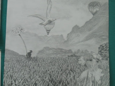
Painting Class. A study. 2009
Acrylic on board

What caught my attention about Miro's was the originality and creativity of each of his pieces. Miro's abstraction differs from that of other artists of the time, the vividness of his pieces, not only in his colors but also in the unique designs and representations of every object in them, made Miro one of the best painters of his time.
This piece was made using Miro's style, but with a quite modern method, using two pieces that form the big picture.

April 6, 2010

25) Totem's Common Room

Second semester started, and my goal was to take as many art courses as i could. I made huge mistake during the first semester. It turns out that the credits that i was suppose to get from my VISA 183 class didn't count because i already had those credits from IB Visual Arts. I hadn't noticed but under "transferred credits" that i received from IB, it said that they counted like VISA 180, VISA 182 and VISA 183. Never saw that. Big mistake. But it was done and i can't say it was too bad, after all i did learn new things in that class.
The art courses that i took during the second semester were: Painting, Drawing and Digital Arts.

Painting Class. Dene. 2009
Acrylic on board

This was one of the first paintings that i made in that class. We were supposed to make a painting of an interior, emphasizing only one object. I think there was more to it than that but to be honest i don't really remember and i can't seem to find it in my notebook. All i know is that i had to repaint it like 3 times because i wasn't happy with the colors, or because i messed up with the scales and perspectives.
This was the common room of my residential floor in the University, a place where i remember staying up until 4, 5 am working, and studying... and partying at times lol.

24) Llamas and I

I did this one for fun. I took a picture of me sitting on a bench, and added it to the landscape that i took from Cuzco, Peru. I love Cuzco, and i recommend anyone and everyone to visit it.

23) Glocal Photo Challenge

"Glocal (global + local) is an immense, collaborative and multifaceted digital art project that examines the making, sharing and exhibiting of images in the 21st century... The digital revolution has included the global proliferation of millions of image-taking devices (such as digital cameras, video recorders, cell phones, and PDAs) and the sharing of billions of images through online networking and archival sites (such as Flickr). As this democratization of digital technologies makes the ability to make photographic images so ubiquitous, Glocal is interested in looking at the implications of the changing roles and relations of images within the field of visuality. Glocal is particularly interested in exploring the construction and relevance of the 'unique' or 'originary' image in relation to the multiple or 'multitude'".

VISA 110. Tunnel Vission. 2008

In this photo challenge, we were asked to experiment with vignetting, using toilet paper tubes! "The goal of this alternate method of taking photos was to playfully twist cinematic methods and as a result challenge the viewer to reassess common scenes and scenarios when they appear with intensified focus.”


VISA 110. Near/Far. 2008
In this challenge, we were asked to create a pairing of two images. The images together suggested the theme of 'Near | Far'. "It could be that the diptych reflects literally that which is in close proximity and then a more distant version of the same scene."


VISA 110. Photo within a photo. 2008
This challenged asked us to pick a photo (In the Glocal flickr pool or other), print it out and create a new image by superimposing our chosen image on top of a backdrop that we created.


22) UBC landscape

VISA 110. Lanscape. 2008
Photoshop

This is the original picture of a sidewalk close to Totem Park (One of the residences in UBC, the one where i was staying at). I took it during Fall, that's why the maple leaves are all around the floor. I love that season, specially in Vancouver, because of the colors of the trees. It's so beautiful to see bright red trees all around campus, it's somewhat satisfying to look at.


In this second image i added a human, light posts, and several signs. This reflects how humans, little by little are overpopulating nature.


Opposite from the previous picture. I manipulated the colors and the changed the path to a river to make it seem like this picture was taken far away from society.


I edited this last one emphasizing the leaves on the floor. I could be a romantic image or, by adding a black man (sort of creepy) at the end of the path, a scary one. It depends how the viewer wants to see it.

April 5, 2010

21) Iraq Soldier

VISA 110 was the second art course that i took in the University of British Columbia during the first semester. The course provided "foundation level instruction in basic computer skills, image manipulation and digital media."

VISA 110. Iraq Soldier. 2008

Photoshop

This first image is the original picture of a soldier during the Iraq War. My intentions by editing the picture was to change the message the picture was trying to convey.

In this second picture i simply desaturated the entire picture leaving only the cigarette with colors. This gives an emphasis on the role of the cigarettes during war, a symbol of death.


This third picture was the hardest and probably the most successful of all. By removing the cigarette and the dirt in his face, and by adding tears, we distort the image from being rebellious into being anti-war.


This image changes the picture into being the complete opposite of the previous one. It give a sense of malice and joy of war.

20) Bodegon

VISA 182. Bodegon. 2008
Acrylic on Canvas

A small 'bodegon' that was set in the room for us to paint. It was a bit of a hustle since we only had a certain amount of time to paint it and finish it. Most of us had to go back to the classroom after class hours to finish it well.

April 3, 2010

19) Sketches, others

VISA 182. Sketches. 2008
Pencil, Chalk, Colored Powder.

I did a lot of sketches in and out of class, some i had to draw from models, others were simply just for fun, to try different materials and styles.

I normally used pencil and ink, but i also experimented with colored chalk, and with colored powder (When i went to the city of Cuzco (Peru) in 2006, i found a series of colored powders that came supposedly from different stones and minerals. These powders were very interesting because when mixing the powder with water, the color that the powder originally had changed to a different one, in some of them). The hand holding a channel perfume was drawn using one of these powders.

18) Self-Portrait (From Ghana to Canada)

I graduated from IB in May 2008. I left Ghana on the 9th of June and moved to Vancuover, Canada, where i continued my studies in the University of British Columbia. I first wanted to study Arquitecture, but after the first semester i realized i was more into the Arts, so i was concentrating my studies in the Visual Arts. During the first semester in UBC, i took two art courses, one was called VISA 182 (Basics painting and drawing) and the other was called VISA 100 (Basics Digital Arts).

VISA 182 - Self-Portrait. 2008
Pencil on paper.

During the time of this course, we were asked to create many self-portraits. It was the first time i was going to draw mdryself, and i wasn't very confident about it.
This one was one of the best i did (during the class), however, it doesn't really look like me that much so i wasn't so happy about it. People who know me will be able to tell that i'm not exactly like that.

April 2, 2010

17) Surrealist Drawing

Drawing. 2008
Pencil on paper.

This piece wasn't at all related to any school work. I was bored and i wanted to draw something, just like that.
I found a nice surrealist digital work in the net and just as practice i decided to copy it in a small paper.

I've always liked surrealist drawings and paintings very much, it started when i saw Dali's and Rene Magritte's works. I fell in love with the movement right away.

This is a piece that i love very much and i always keep it in a safe place. It's very small but i find it very powerful, and it always reminds me that i can really do whatever it is that i want to do. It's a good feeling.


April 1, 2010

16) Fear

Shark. 2008
Acrylic on board.

This was my last piece before i graduated and left Ghana. This one, like the 'Island' was made with the same purpose of imitating reality's depths and colors.
I chose to paint a shark because it is my worst fear. I hate sharks, and i always find it so hard to even watch them on TV. I wanted to overcome that fear by making a painting of it, because by feeling forced to look at the picture over and over again, i thought i would stop being so scared of them. What happened was that i simply wasn't so scared of that particular picture anymore, but i can't say the same with the rest.

15) Island

Island. 2008
Acrylic on board.

This piece was one of my favorite ones, unfortunately, it got stolen during my art show. :'(
By then i was already comfortable using acrylics, because it was the media that i used the most.
Obviously i had a lot more pieces than the ones i am showing in the blog, but it's because these are the ones that i think are the most important and significant in my life.

The picture was taken from a national geographic magazine. I was inspired by Muller's* creation of depth, usage of shadows and lights, and realistic, almost perfect shapes. This island was one of the last pieces i did before finishing the IB

*Muller = Edgar Muller, an artist who, like Julian Beever, created marvelous street art.

14) Perspectives. Non-smoking sign.

Non-Smoking Sign. 2007
Wood, cardboard, latex. (45x45x45 in)

I started with the idea of the cornered frames and the 3rd dimension, and finished with a complete study of perspectives and optical illusions.
With this piece i wanted to experiment with the optical illusions that many artists had been working with. Ex. Julian Beever (An artist who is know for his chalk art in the streets). It always amazed me how our visual system could flip into thinking that it can see a flat, 2D pattern, when in reality it's a disjoint 3D one. I chose this specific sign for personal reason (I don't smoke).

The creation of this piece was a bit more complicated that the other one i had previously done. I build this room by my own, put every piece in this room together creating a more challenging surface to work on. How did i do it? It took me a while to figure out how myself, but it honestly looks harder than it actually is. I projected the image onto the surface and traced it with a pencil. Then i painted it.


This images are examples of the perception of depth in vision. From a specific perspective, we perceive the image of the non-smoking as a 2D image in a 3D surface, however, if we move from that perspective into another one, even if it's only 5cm to the right, the image will be distorted and will not show the image in its perfection.

13) Framed Marbles

3 sides cornered frame. 2007
Crystal balls on board.

"One of the themes i am working on is the 'different dimensions'. This is the beginning of a bigger piece of art where dimensions and perspectives are manipulated, modified and authorized by me. I chose to make the frame in a way that it exploits the idea of the 3rd dimension, and i filled it with crystal balls to add up to the 3D and a more vivid view. The shininess and the perfect circular shapes of the marbles express the simplicity and pureness of nature, which is something that i love." - Pilar Rodriguez 15/10/07

Applying the same ideas from the previous piece, i create this new cornered frame. This time i added a bit more of challenge to the work by adding an extra side to the frame, and by changing the texture of the 'eyes'. Some of the feedback that i got from the previous piece was that if i was intending to portray eyes, i should have used a more realistic and believable material, like crystal balls. In this piece the crystal balls are a symbol for 'eyes' or nature.
I kept experimenting with the idea of the 3rd dimension, and i wanted to keep experimenting with it little by little before starting on a big 3D piece. Which you will see later on.

12) Eyes

Cornered Frame. Eyes. 2007
Mixed Media. Styrofoam or canvas.

Combining both ideas of Damien Hirst (Except this time i didn't use real eyes, but simulations if them) and Yoko Ono, with the idea of a cornered frame.

I wanted to expand my boundaries from a flat plane to the third dimension. I created a simulations of eyes (Of all living animals) and pasted them onto a canvas on a cornered frame, which i made myself and painted in bronze, so that when hanged on a corner it gives the sensation that you are constantly being looked at.


11) Tricia Courtney's monochromatic

Fall. 2007
Acrylic on board. Palette knives.

I was inspired by Tricia Courtney's paintings of trees. The method she uses to paint with palette knives, which gives the painting a lot of texture, caught my attention a lot and so i decided to try something similar.
At that point in my life i just wanted to try as many things as i could, experiment with different surfaces, media, and method of applying it. This time i wanted to try painting with pallet knives, something i was completely new at.
I chose to make my painting monochromatic because i wanted to concentrate not on the color of the image but on its texture.

March 31, 2010

10) Surrealist Collage/drawing


Surrealism
. 2007
Pencil on paper.

This is a drawing of a surrealist collage i was asked to do.
It was the first time i tried drawing something extremely detailed, in such a small space.

What i found most challenging of this picture was the grass. It took me really long to get that done.

9) The more he saw the less he spoke..

“A wise old owl sat on an oak; The more he saw the less he spoke; The less he spoke the more he heard; Why aren't we like that wise old bird?”

2007 Acrylic on board.

My first piece in acrylic paintings.

8) Eye Non sense

Damien Hirst's 'Natural'. 2007
Green Jello, Cow and Goat eyes.

We finally got freedom and I started creating pieces of my own. In my entire life i had always seen a type of art that was completely opposite of what i do or what i thought i would always do. I never really understood why people had that stereotypical belief that 'good artists' tend to be weird and creepy sometimes, so i needed to try that. I wanted to go all wicked for once and see how that felt, and that's how i decided to follow Damien Hirst.
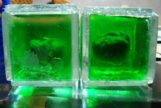
Hirst, a British Artist, known for his 'Natural History' series, which present dead animals (such as sharks, sheeps, cows) in vitrines, preserved and sometimes cut-up in formaldehyde. This caught my attention and became my main inspiration for my piece.

In my piece, instead of cutting an animal in parts and preserving it in formol, i used cow and goat eyes (That i bought in a Ghanaian market. 'Makola' Market) and placed them inside green jello that i bought in Max Mart, a grocery store (Pretty good one too, i used to get everything there lol). After i had finished placing all the eyes in the jello and taken them out from the fridge, i cut cubes of jello with the eyes in it and placed them in small cubes i made of glass (I also bought the glass in the market... you can really find anything there it's awesome).
My final piece was 6 of those small cubes with an eye in each of them. The weirdest thing i had ever done in my life.

7) Meta Warrick

Key. 2007
Carved on Soap Bar.

This was another of my pieces where i used the "Key" as my chosen object.
I was inspired by 'Meta Warrick Fuller', an African American artist whose sculptural works were mainly made in bronze, clay, and plaster. When i saw her sculptures i decided i should also try one for the assignment. I wanted to go for the materials her sculptures were usually made of, but i thought it'd be much better to create one out of something unusual. How about soap? Lol

My initial idea was to make it standing, leaving only the bottom part of the key attached to the 'ground' rather than having it lying on it, but since i was living in Ghana, the heat was an issue and i don't know why i thought it would melt easily. Silly me. It would have looked much better.

6) Guerrino Boatto!

Key Project. 2006.
Watercolor on board.

When i was still getting used to painting with watercolors. We had to chose a single object and create several pieces representing that object using different media. This on was watercolor.

I was inspired by the painting of Guerrino Boatto, a surrealist artist who made this amazing painting of a puzzle falling on the shore of a beach. I changed the puzzle for a key, which was the object that i had chosen.

It was probably one of my pieces that i liked the most out of all until that point.

5) The Infinity of Art

Genre. 2006
Mixed Media.

The Infinity Of Art (Text Written in 2006 -11th grade)

"The idea each person has about art differs from one another, nevertheless non of them are wrong. This piece, made out of everyday materials (Toilet paper rolls, and a long string), is a Dadaist reaction to the writing of Leo Braudy who criticizes the idea of genre, a classification of art.
The spiral i made is a contradictory object that goes against the concept of the categorized 'genres' but at the same time it's an object which belong to what people call DADA. Puttig a spiral made out of toilet paper rolls on the floor, for some people, doesn't mean anything, and for that reason, because it makes people question whether it is art or not, because it is completely different than anything else anyone has ever done and because of its absurdity and uniqueness, it is a Dadaist piece.
'The Spiral' symbolizes infinity since it can go on forever. However, because it is impossible for a human to reach infinity, i chose to put all those mirrors surrounding the spiral, giving it a sense of never ending. The reason for why i chose the 'infinite' symbol is because art, in my opinion, has no limits. No one and nothing should stop you from feeling free to do anything you want to do and then call it a piece of art, not even should you be limited by the already set styles, the movements.
The different colors in the spiral represent the different genres of art, that when put together create a unique art object."


4) Organic Forms

Watercolor. 2006.
Watercolor on board.

I had never really painted in watercolor before. It was fun. The assignment was to find organic forms and make a painting of it. What's more organic than nature?, I thought. So that's what i chose.

I've got almost all of my paintings at home and i'm already running our of space in my room so i want to start selling as many as i can. If you are interested in any of them, just let me know.